In this post, I'm designing the DVD Label for the package.
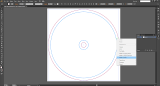
I start off by opening the DVD Label Template I made earlier; I then select the measurement line and turn them into 'Guides'. By doing this, the guides are able to show through all design laid on top of them, meaning I can work as normal, designing with the constraints in mind instead of having to guess or keep re-editing.
For this Label, I had two design ideas in mind; the first was based on a '70s style wallpaper design, with the background of the label being circles of funky colours in a pattern. The second idea was to make the label a 'vinyl'; making it black with lots of circles and a centre spot of colour, resembling a vinyl.
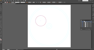
I started by trying to make the first idea, I drew a normal circle for for starters.
I then filled it in Yellow; this circle would be the outermost circle in its pattern and so it has the lightest colour.
I drew a second, smaller circle within the yellow one and coloured it in Orange.
On to the third circle, smaller than the orange one and filled in Red.
Now for the last circle in the pattern- the smallest of the lot, it was coloured in Brown.
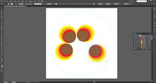
I went ahead and duplicated the design so that there were four lots of circles.
I rotated the circles collections so that the brown circles were all 'facing' each other.
This is what the rotated group looks like, groovy, no?
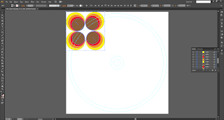
I made the collection smaller and fit it in the corner of the page.
I then right-clicked and made the circles a Group. That way the circles wouldn't come apart when moving them around and all the groups thereafter will be uniform with the first group.
I copied the group and pasted it next to the first one.
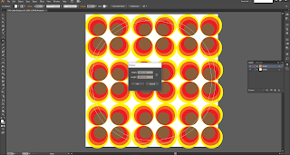
I repeated this process until the page was covered with groups of circles.
Unfortunately, at this point my illustrator file became corrupt when it came to re-opening it. This meant starting again from the beginning with my circles. I kept the same colours, but the circle proportions are slightly different.
So now I had a bunch of groovy circles on a canvas, and a some circular guides; I needed a way to make it so I could only see the inside the guides- and effectively 'cut away' the excess design.
I learnt about a tool called a 'Clipping Mask'. A clipping mask basically uses two or more layers and uses the design/shape of the bottom-most layer and masks everything around it for the layers above the mask, leaving the inside of the mask visible.
I created another circle the size of the outer guide and placed it directly in the centre of the page so the lines would match up.
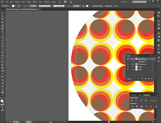
I selected all of the circle patterns and the big white circle; I went to the clipping mask option and clicked 'Make.
Like magic, the contents of the page had reversed! Everything outside the circle disappeared, leaving everything inside visible.
I left the first idea like that for the time being. I decided to get started on Idea No.2, the vinyl label. After making sure all my layer so far were organised, I created black circle as large as the outer label guide.
I learnt that if you select the Ellipse tool, find the centre of your design, hold 'Shift' and left-click, you can enter the dimensions of the ellipse you are trying to create. I decided to make a circle 5mm smaller than the outer guide.
I then coloured the stroke grey and made sure there was no fill colour.
I continued to repeat this process, creating blank, grey lined circles, each 5mm smaller than the other until I got to 85.5mm from the centre. I left the gap to emulate a real vinyl; from the vinyls I've seen, they leave a gap in the centre near the the label- I think the size of the gap differs depending on how much of the vinyl has been 'used'.
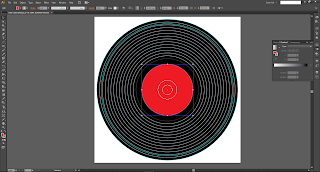
I made a smaller, red coloured circle in the middle of the vinyl to act as the vinyl label.
I made another circle, with a darker shade of grey just outside of the label to act as the 'cut-off' groove; after the recorded material has been played through, there is usually a groove that keeps the vinyl rotating until the vinyl is stopped.
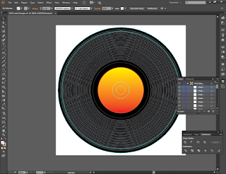
I applied a Gradient to the vinyl label in an attempt to give it a '70s disco vinyl feel.
I rotated the gradient so it swept from top to bottom (or vice versa).
I changed the default colour to orange and yellow, resembling a sunrise.
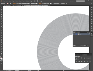
The vinyl was coming along, but I wasn't happy with the look so far; so I decided to add even more vinyl groove lines, each 2.5mm apart.
This caused the grooves to look far too large, so I selected all of the grooves and reduced the stroke weight from 1pt, to 0.5pt.
I felt as though the gap between the 'end' groove and the other grooves needed to be closed up, so I made more grooves until they were 58mm from the centre.
On the edge of a vinyl, there is usually one or two grooves that act as a lead-in to the grooves with sound in them; that way the needle can be placed on the vinyl without it starting part-way through a recording.
To replicate this, I made the outermost groove a darker shade of grey.
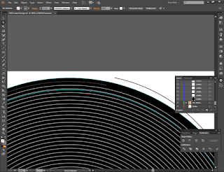
I used the 'Add an Anchor Point' tool to add a point on the outer circle's line.
I clicked on the option to cut the path at the selected anchor points, allowing me to manipulate the circle as a line instead of a circle, now that it has a beginning and end point.
I then dragged the 'cut' circle point down to the second groove in, achieving the effect I was going for.
I still wasn't happy with the way the grooves looked, so I created another Illustrator file as a blank canvas and created some grooves, all 1mm apart.
Aligned them...
And they looked like this. The problem was, now I had so many grooves, the individual lines were too thick!
So I reduced the stroke weight to 0.5pt again- still too thick.
I tried 0.25pt- getting there but still too thick.
Then I tried 0.15pt and was really happy with the way it looked now.
I left the vinyl as it was for now, and tried to see what would happen if I turned the vinyl layer visibility off, but left the grooves on; I ended up with a '70s decor picture disc!
After a lot of contemplating, I decided to go with Idea No.1 as I felt it would suit the theme of the DVD Wrap better, especially since I took the label design and used it as part of the wrap.
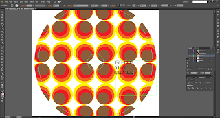
So I got down to making the label properly, starting off with trying to make the movie title.
I typed the title in a text box and changed the font to Pioneer BT accordingly.
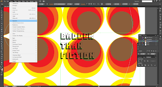
Illustrator is different to Photoshop and I didn't whether or not there was an option to colour text similar to Photoshop. So I 'expanded' the text, making the letters editable as their own objects.
I then un-grouped the letters...
And tried to change the fill colour. Exactly the same issue as in Photoshop, the Pioneer font doesn't allow the blank section of its letters to be filled, only the black outline.
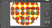
So I copied the title text from the DVD wrap over into the DVD label. For some reason, the text copied with a white background. This was an issue because I hadn't found a tool like the Magic Wand tool in Photoshop to get rid of the white background.
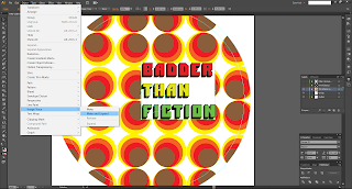
I used the 'Image Trace' tool to try and see if I could separate the text from the background. The Image Trace tool tries to 'trace' the image you tell it to, separating parts of the image into separate, editable objects.
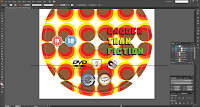
Unfortunately the first attempt ended up causing this:
So I clicked undo and noticed that there were different options of the Image Trace- you can specify what type of image it is to trace, and Illustrator will look for different details accordingly.
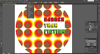
I set it to High Fidelity photo as I wanted to get all the colours and lines in the image.
A dialog box came up, to which I clicked 'OK'.
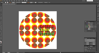
And suddenly, the were loads of object lines on the title!
I moved the title off of the Label so I could see what I was doing; then, I un-grouped the new objects.
I found the white background as an object in the group, and subsequently deleted it.
The Image Trace left detected the white background near the edges of one of the words as separate objects too.
So I located them and deleted them also.
I then regrouped the title objects so they didn't all fall apart or cause any inconsistencies with editing them.
The title was then placed back on the label.
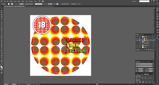
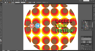
I imported the BBFC 18 certificate logo from a vector file I found online and placed it on the label; I also reduced the size of the title at the same time.
I also located a set of IFCO certificate logos online.
I imported the the '18' rated logo onto the label.
I placed the rating logos next to each other and made them the same size.
I noticed that for some reason, when I shrunk the BBFC logo, the outer line became thicker.
This is an issue I also had again very soon, which I will discuss then...
For now, I reduced the outer stroke weight so it looked normal again.
I then imported my Production Company and Distribution Company logos onto the label.
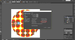
I tried to reduce their size when all of a sudden, the stroke weights went out of the window and the logos looked bad. I couldn't figure out why, so I took to the internet and found a very useful stackexchange post on the same issue.
Apparently, I didn't have the "Scale Strokes & Effects" option checked in Preferences, so I went and ticked it.
I deleted the logos, re-imported them and re-shrunk them- much better.
I placed them at the bottom of the label, one on either side of the label.
I imported a vector image (.svg) of the DVD video logo.
And shrunk it down to size, placing it under the other logos for now.
I found an image with all six region code logos on it; as my movie is PAL and made in the UK, it would be Region 2.
So I cropped the image in Photoshop, making the image show only the Region 2 logo.
I imported it into Illustrator but had the same problem with the white background. I also tried Image Trace, but it just wouldn't pick up the details of the image.
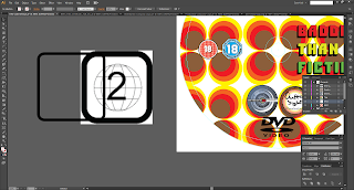
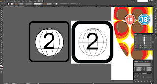
So, I took the region logo off the label and to the side and decided to make the logo myself.
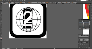
I used the Rounded Rectangle tool to create a rounded square the same size as logos'; I couldn't replicated the roundness of the corners, but it was close.
I used the Ellipse tool to create an ellipse exactly the same as the one in the logo. I then used the Line Segment tool to create the straight lines that go across the 'globe' in the logo. In retrospect I could have used the Pen Tool, but I hadn't thought about it- I noticed the Line Segment tool and just used it because it draws straight lines more easily.
I then used the Pen Tool to create beginning and end points to the vertical curved lines, and held the left-click button down to alter the curving of the line to match that of the curves in the logo's lines.
Then I continued doing this until all the lines were done. One frustrating thing I noticed was that I had to go out of the Pen Tool and then re-select once done with a line, otherwise the line will connect to the next point you create.
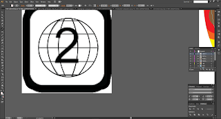
I used the text tool to replicate the number on the logo, coincidentally, the default font seemed to match the font used by the logo almost exactly! I adjusted the font size until it matched properly.
Then, I zoomed in on the newly-drawn logo and clicked on some of the lines to extend them to the edges properly.
I created another ellipse the same size as the first and filled it in White. I deleted the original and placed the new logo on the label.
I found a download file containing a range of different 'copyright warning' logos (it also contained anti-copyright logos, but we won't get into that...), I downloaded it and got the file I was looking for, the MPAA copy protection logo.
I imported it into Label, luckily this time the white background was intentional, so I deleted the background.
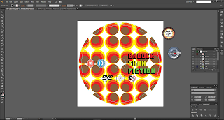
I re-organised the logos under the centre of the label.
I placed the production and distribution logos underneath the other logos again, whilst shuffling the logos above a little more towards the edge of the bleed guide.
I created another circle the size of the outer edge of the label, and used the "Type on a Path" tool.
I typed in the "all rights reserved" text...
...and experimented the with the available Path tools to try and get the text to face 'inwards', towards the centre of the label.
I made the font much smaller and was experimenting with different fonts; I tried Kabel Black as found on the DVD Wrap to see how it looked.
I then tried "Franklin Medium Gothic Condensed", I quite liked this font because the letters were 'thinner' making it look more a like small print should.
I reduced the size of the text path circle to ensure all of the lettering fell inside the label and was not susceptible to getting cut of by staying in the bleed area.
I drew a straight line to help with balancing the text, making sure one side wasn't higher than the other.
I had forgotten to add the Copyright symbol to text, so I added it and re-balanced the text.
Because of the stroke weight issue earlier, I re-imported the BBFC logo and replaced it.
I added text underneath the certification logos, to distinguish where they are from accordingly- BBFC = UK, IFCO = IRL
I got some feedback on the design; it looked to congested towards the bottom, and that the title text would look better at the top of the label.
So I took the feedback into account and re-organised the logos.
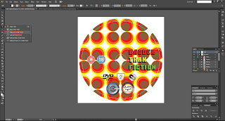
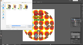
I was now happy with the way it all looked, and so I exported the finished design to an appropriate render format. In this case, as the label would go to print, I exported to a TIFF file to as it is a lossless file, meaning it retains all picture quality.
I opened the TIFF file in a photo viewer to make sure it works.
And that's it for the DVD Label, it was definitely very different from working on the wrap; I've learnt to use different tools that aren't available in Photoshop such as Image Trace. I find that there are pros and cons to both programs, but they need to be used together sometimes to achieve end goals.
Thanks for reading!
Hasnain







































No comments:
Post a Comment