In this post, I'm designing the logos that will be featured in the DVD package.
As opposed to the DVD Wrap, I will be creating the logos using Adobe Illustrator- this is because Illustrator is used for creating and editing Vector based graphics whereas Photoshop renders to file such as PNG, JPEG and TIFF.
The difference with vector based graphics is that they are scalable; this means they can be resized many times without losing image quality. This is achievable because vector images are mathematically calculated, as opposed to renders which are created using individual coloured blocks.
Scalable images are a good idea for logos because they can then be applied to various products at different sizes without having to re-render the original image at different sizes.
I have created two logos, one for production company of the film and the other for the distribution company.
Production Company
The production company for a film is the company that in charge of the production of the film (as the name may suggest...), this involves the physical shooting of the film, editing, script writing, etc.
As my movie is going to be a '70s based action movie, I wanted to create a logo that reflects the kind of movie this company makes.
I tried to think of a catchy and suiting name for the company; I ended up with "Outta Sight Productions", Outta Sight being a shortened/stylised version of the '70s catchphrase "Out of Sight!". With this decided, I began to make the logo; I wasn't quite sure where I wanted to go with it, except for the fact that I wanted it to look quite 'organic' and not strictly professional looking.
I began with a blank canvas in Illustrator.
I started with the Paintbrush Tool; as I wanted to make it look partially drawn, I wanted to try my hand at making the main title of the logo manually instead of typing it out.
At first, I tried to make the 'A' in Outta look like a star, I wasn't happy with the inconsistency in the writing so I used Eraser Tool to rub it all out and started again.
I then thought of trying to make the logo look as if the letters in Outta were coming out of the 'O'.
I tried with just 'utta' and also tried fitting the catchphrase in the 'O', but nothing looked quite right; in fact, the 'O' kept looking like a 'C' instead.
I decided to look around Illustrator to see what I could find- I haven't really used this tool before, so I was exploring. I discovered a load of Brush Libraries and was going through them when I discovered a Brush named 'Palette Knife' in the 'Artistic_Paintbrush' library. The preview-stroke looked interesting so I tried drawing an O and immediately liked it. It reminded me of calligraphy or writing with quills.
I tried writing the catchphrase again, drawing a little slower in order to be smoother and ended up with this:
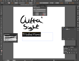
I was really happy with the writing, but wanted the 'productions' to be typed just for a little variation and professionalism. I tried a few different fonts before coming across a font named 'Lindsey', I hadn't liked any of the previous fonts and went with this one.
I wasn't too comfortable with it looking the way it did normally, so I tried to mess around with the character settings. I adjusted the tracking for the lettering to try and space the characters out a little bit.
I then decided to go through the font list again and found 'Brush Script Std Medium' and decided I really liked it.
I wanted to try and change the typing from just standard form and went around trying out different effects to see what would happen.
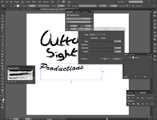
I tried a Distort & Transform effect called 'Zig Zag', it looked to jagged for what I was going for, but I liked the effect nonetheless; perhaps if my work was based in the '80s...
I then tried to to use the 'warp' effect on the 'productions' to see what it would like; I ended up not liking the way it turned out- it felt as if I was trying to add too much 'roundness' to the design at the same time.
Then I came across a really interesting effect named 'Scribble', as you can imagine, it basically took the typed wording, rendered it in a way that made it look as thought it was 'scribbled' in a single stroke. I really liked this idea because it was a bit unusual and I felt it gave the design more character.
I like circles when it comes to logos, I think they give a sense of continuity and make the design look whole; they also make it easier when it comes to figuring out where the design ends so you can establish design 'parameters'.
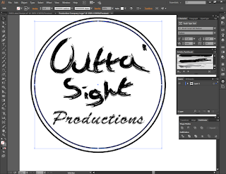
I drew a circle from the centre outwards using Alt + Shift (shift makes it uniform size, alt makes the centre 'expand' from the middle of the pointer as opposed to it following the pointer when dragged) which encompassed all the wording.
I then increased the the circle's stroke thickness to 5pt, and created a smaller circle inside it at 4pt.
I then decided to go looking through the brush libraries again when I came across 'Artistic_ScrollPen'; this library was full of long lined designs consisting of unequally thick lines. I accidentally applied one of the brushes to a circle and like magic, the entire logo transformed; it looked like a seal/stamp of approval! I really liked the happy accident and decided to keep it.
I thought the design looked a bit plain though, and went exploring the libraries to see what else they had to offer. I discovered the "Arrows_Standard" library and wanted to see what happened if I applied a brush to one of the circles on purpose.. I applied an arrow brush and was surprised by how it spruced up the logo.
I still felt the logo was a little monotonous, so I changed the stroke colour and the circles' opacity, so the arrows were coloured, but not completely opaque. I liked the arrows on the stripes because they reminded me of a vinyl record; usually vinyls are played in the opposite direction to the arrows, but I like them the other way around; perhaps it shows that this company is different from others?
I had an idea for the logo, intended to make a reference to the type of films the company makes. To cater for this, I increased the size of the circles to make room for it; I also took this time to re-organise the layers and elements I had created.
I created a few circles...
Then selected them all and coloured them in Black with a Grey stroke.
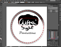
I then used the 'Unite' option in the Pathfinder to join all the circles together. The idea was to make it look like an afro.
I then selected the "Outta'" and inverted the colours to you could see the word again.
I used the Eraser tool to cut a line through the afro...
... and used the paintbrush tool to create a bandanna going through the afro.
Whilst I liked the idea in concept, it didn't seem to translate very well; so I abandoned the changes and reverted to the smaller design.
I thought that the apostrophe in Outta' was a little too close to the circles, making it look like its getting lost in them, so I dragged the apostrophe closer to the word.
I then drew an exclamation mark to emphasise the phrase; it also makes the design look bit more friendly.
I wanted to try and add some more colour to the logo; I tried to achieve this by drawing another circle and filling it in with gradient which I then rotated. It looks like a sunset, which I quite liked, but I thought it looks too similar to a DVD Label design I had in mind.
So removed the sunset circle for now, and attempted to go for a different design inspired by 1970's interior decoration- I liked the stripes and colours commonly found in '70s designs. I started by creating another circle and colouring it brown.
This was then followed by three more rings, each one smaller than the last and each a different colour- Yellows, Oranges and Browns are common colours I have seen, by using them in the logo I have tried to reference the type and style of movie this production company normally makes. Each ring was 12pt thick and had a some white space left between them to break the design up a bit.
And that is the production company logo! I feel that its a bit simple, but it portrays what I intended it to and so I'm happy with it.
Distribution Company
On to the Distribution Company logo!
The distribution company for a film handles the other parts of film making, such as the promotion of movies, the creation of the products that will be sold to consumers and their pricing along with this.
I imagined that the distribution company for this movie would be much larger than the production company and as such, would have a more professional looking logo.
I tried to think of a clever name for the company, they deal with all sorts of different movies, some being more offbeat than others. I imagine their ethos would be to put the films at the heart of it all, and with that, I suddenly thought of the phrase "Shot through the lens"- the lens being the camera lens that photos/videos are captured through. I added the word 'Entertainment' on the end and ended up with a professional sounding company.
With a clever name, I wanted to create a clever logo- I thought of making a camera lens with a crack running through it, as though it had been the one 'shot' instead of the one doing the shooting.
And so it began...
I started with another blank canvas in Illustrator.
With a clever name, I wanted to create a clever logo- I thought of making a camera lens with a crack running through it, as though it had been the one 'shot' instead of the one doing the shooting.
And so it began...
I started with another blank canvas in Illustrator.
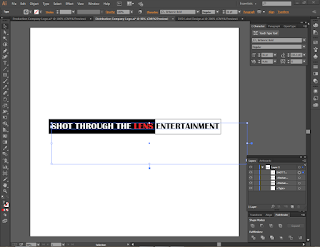
I typed up the title, "Shot Through the Lens Entertainment" and tried to find a font I liked; I found the font "Britannic Bold" and liked it because of the way it is styled- thick bodies, but it gets thin at the or in the middle of letters, reminiscent of fonts found on Broadway and the famous night club "Studio 54".
I wanted to split the title up to give it a professional looking feel, something a bit different to just one block of single coloured text. So I created a rectangle that stretches over all the words except 'Entertainment' and filled the box in black. I then highlighted the obscured text and changed its colour to White. I then duplicated the black box, coloured it white and dragged it next to the black box; I then shortened it to fit the last word and not overrun.
Playing on the idea of being 'shot' through the lens, I coloured the word 'Lens' in a bright shade of red to make it look like blood.
I got a bit experimental and wanted to see if I could make a 'trail' from the bloodied word, so I duplicated the text, deleted all but the word 'Lens' and then coloured the word a darker shade of red. I then positioned the word directly under the first instance of the word.
I repeated this process, colouring the third 'Lens' a darker, but more purple-red colour and placed it under the second instance. The trail had been achieved and looked pretty cool I thought, reminiscent of 007 movies.
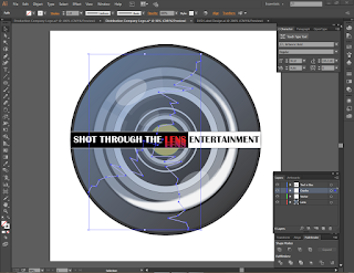
Now on to creating the lens itself, this consisted of lots of circles, emulating the many rings found in a camera lens. I was getting a rough idea for the number of rings and their size from this image. I started with a big circle, just about as wide as the boxes the text were in; then I coloured it a dark grey.
I then made a small yellow circle as the centre point, where the opening for the lens would be. I made a bigger, black circle and placed it behind the yellow circle to give it a 'gap'.
I repeated this process a good few times, creating circles of different sizes, some a little larger than the last, others much bigger- this was done to create the distances between the different rings in the lens. Each circle was placed behind the one in front of it; if you could view the layers in 3D, they would resemble a pyramid.
At this point, the structure of the lens was done, but it looked really flat. So I created another circle the size of the first circle (the main, grey, outer one) and applied a gradient to it. At first, the default position for the gradient meant it swept from left to right at 'dead-horizontal' view. I rotated it so it looked a bit more like natural, sweeping from the top-left downwards.
I made the gradient circle a bit smaller to differentiate between the lens and its outer body- the lens doesn't stretch all the way to the edge of a lens normally does it?
I got some feedback from classmates who agreed that the lens could use some 'reflection' in it. I found a free-to-use vector image of a lens produced in Illustrator that had the reflection I was going for. So I downloaded it, and selected a few shapes that together, created an illusion of a reflection; I dragged them over to my lens.
I then resized them to look as they should- the reflection don't just 'occur' on the lens, they needed to match up to one of the rings on the lens, and so they were appropriately re-sized.
Time to break the lens! Not literally... I used the Pen Tool to create a thin, white, jagged line from the edge of the lens to the centre.
I then duplicated this 'crack' and rotated it, having it come out of the other end of the text at angle. I drew a third crack to come out from under the text too.
I found an effect called 'Drop Shadow' and applied it to the cracks to give them depth, as though the cracks were deep, not just surface level.
And that's all there is to the logos! Arguably the 'simplest' designs in the package, I had fun creating these because I had to do it from scratch; compared to Photoshop where we edit and manipulate pre-existing images, Illustrator work usually starts from the beginning. This was a nice change of pace. Now I need to add them to the rest of the work!
Thanks for reading!
Hasnain
References
Images
n.d. Available at: <http://thenewnomads.com/wp-content/uploads/2015/03/camera-lens-close-up-hd-wallpaper.jpg> [Accessed 27 April 2016].
n.d. Available at: <http://static.vecteezy.com/system/resources/previews/000/016/653/original/camera-lens-vector.jpg> [Accessed 27 April 2016].













No comments:
Post a Comment