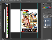
In this post, I'm designing the spine for DVD Wrap.
This post is much shorter than that of the front panel, mostly because the area I'm working with is much smaller, meaning I can't put as much on the canvas- this means the design is much more simple.
I started by loading up Photoshop and creating a new file with the dimensions of the Spine panel.
The spine of a DVD Wrap usually has the title of the movie on it so people can easily distinguish what film they're picking out, especially if the movie has been put away on a shelf, just like a book.
So I had two ideas for how to display the title:
1. Write the title out in one sentence and rotate it sideways,
2. Write the title vertically- each letter is the write way up.
I decided to try both and see how they look. I tried the first idea by creating a text box, typing the title and changing the font to the title font, Pioneer BT.
I then rotated the title and left it as it was for the time being.
For the second idea, I went to the Text Tool context menu and selected the "Vertical Type Tool"; I dragged a box and started to type in it. I'd never used this tool before and so it was quite strange seeing the text write out like it did!
I opened up the 'Whole Wrap' file and dragged the black border from the front panel across to the spine panel file. I then adjusted the border dimensions accordingly so that it actually fit the canvas.
I decided to use the second idea because it looked a little different and interesting; so I painted the text in same colours as the front panel title.
I copied the DVD logo from the front panel and placed it on the spine after shrinking it down to size.
I wanted to put an image on the spine, as most DVD wraps have a still from the movie or an image related to the movie. Seeing as how Samuel Jackson ended up not being featured on the wrap, I thought I'd put him here.
So I got the image of him, shrunk it down and placed it above the text.
I erased the border around him...
And drew my own using the Rectangle Tool.
I reduced the stroke weight a bit so the picture wasn't too covered by the border.
Similar to the front panel, when it came to copying over to the whole wrap, I noticed that the black border stretched beyond the bleed guide. So made the spine border shorter to fit.
I raised the DVD logo a little bit so it looked more natural now that the spine border had been shortened.
I also saw part of the picture of Sam Jackson was showing on the Front Panel- a part of the picture covered up when the spine was on its own, I addressed this by simply erasing that unwanted section.
Then it came to adding the BBFC certificate to the panel.
I moved it down beneath the title and shrunk the certificate so it fit between the border.
I then added the Production and Distribution company logos- some wrap feature one or the other, and some feature both. I figured the wrap would look good with both of them.
I reduced the size of the title and the logos to make space for them all as the panel looked a bit congested.
I applied the Posterize adjustment to Samuel Jackson.
I then mirrored the changes on to the whole wrap by selecting the affected layers, dragging them across and positioning the images where the pre-existing ones were.
I then re-adjusted the sizing of the some of the elements as they were overrunning onto the DVD logo.
I then had the idea to duplicate the folded paper effect from the front panel onto the spine.
I duplicated the layer, moved it into the Spine Panel folder in the layering window and placed it underneath the logos. I moved the section of the paper I wanted to keep for spine and erased the rest.
After receiving some feedback, I decided to use the other title idea; because it's easier to read and would look more uniform with other DVD's, especially when stored.
I applied the 'Stroke' layer style as the black outline of the text looked a little too thin, so by adding a 1px stroke, the title retains its looks but looks enhanced and bolder.
I made the title text a little smaller and moved it up towards the picture. I increased the size of the logos and moved them a bit too.
I then applied the changes to the whole wrap too; I noticed the distribution logo was slightly off centre so I fixed that. The title looked too big on the whole wrap, so I adjusted the size a little bit so it was 'pushing' right against the borders.
And that's all for the Spine Panel! One more panel to go...
Thank you for reading,
Hasnain


No comments:
Post a Comment