In this post, I'm designing the back panel for the DVD Wrap.
This is the last of the three panels required for the wrap.
I started by loading up Photoshop and creating a new file, entering the dimensions to match that of the back panel size.
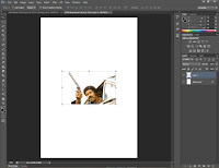
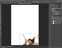
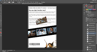
The first image I placed on the panel was a picture of Black Dynamite pointing his gun out of a car. I then moved this image to the bottom right-hand corner of the canvas.
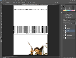
I dragged the black border from the front panel to back panel as I wanted to use it for the same styling purpose- '70s poster feel. When I dragged it across, the border was much smaller than it should have been. I checked the image size and noticed it was way out in terms of proportion and should have been much smaller. I'm not sure how I didn't notice this earlier...
I changed the dimension to the Amaray standard in millimetres and made sure to uncheck Constrain Proportions (this would not let me make a rectangle essentially as both height and width values were the same.).
I deleted the border and then re-imported it. It then fit as it should have done.
I centred the border so the gap was equal on all sides.
I started to write an excerpt from a "review" the film had gotten; at this point I was working on a computer that did not allow me to install fonts, so I made do with preview screen shots. I retyped the text later when I was able to use my personal computer.
The duplicated the screen shot and erased half of each in order to make one whole sentences.
I then merged the two halves into one layer and enlarged it.
I wanted the review to come from a well known source and I couldn't think of an individual critic, so I picked the The Daily Telegraph. I went online to find their logo, and found it on their website.
I shrunk the logo to make it fit with the rest of the review excerpt.
DVD Wraps usually have a bar code on them for store use, so I found a website that generates bar codes dependant on your input. I selected the option to create a 'Code 128' bar code and entered the name of the film- Badder Than Fiction; I then downloaded the generated bar code.
I shrunk it down for the time being.
I started on writing the blurb for the cover; first, a heading.
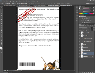
Then I wrote the actual blurb for the movie, full of '70s slang and a plot that doesn't sound too out of place.
I made Black Dynamite smaller and italicised a word, emphasising the amazing soundtrack the movie has.
In an attempt to make the wording look nicer and more clean, I changed the justification.
A classmate gave some feedback, suggesting that maybe I try to add some elements to the panel to make it look like a classified file; I searched for an image of a 'classified stamp' and managed to find an image.
I imported it, made it smaller and rotated it, I liked it, but needed to sort out the text in front of it due to potential readability issues.
In my attempt to make the wrap look old, I wanted to use an image of a 'coffee ring', making it look as though the wrap hasn't been looked after too well, causing some wear and tear. I found a .png image of a coffee ring and imported it.
I drastically reduced the font size to make some space and make sure words didn't get cut off halfway in the text box. I also made the coffee ring and classified stamp invisible for the time being.
I changed the heading font to Kabel Black, a font seen throughout the package so far and one used in real '70s posters.
I went about finding some image still from different '70s action movies to give the back panel some aesthetic and eye-catching visuals. I wanted to take the images from well known '70s movies to avoid making the wrap just about Blaxploitation films; even though it mainly consists of Blaxploitation, I wanted some variety in the imagery. I found images from:
The Man with the Golden Gun (1974)
The Warriors (1979)
Dirty Harry (1971)
Gone in 60 Seconds (1974)
I then imported the images onto the panel.
At first, I was going to try and use the image from Gone in 60 Seconds as a background to the text, but I didn't like the look of it.
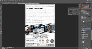
I then thought of trying to go for a 'film strip' sort of setup, showcasing the different stills as though they were part of the film reel.
I started to create the strip by creating a empty rectangle with a black stroke; I also rotated it.
I placed three of the stills in the rectangle and rotated them too.
I made a rounded rectangle for one of the still to see how it would look surrounding the image. I liked it and made two more duplicates for the other images.
I then filled the rectangle in black to look like a film strip, I also coloured the rounded rectangles white so they could be seen.
I made one small, white rounded rectangle to act as one of the holes seen in the side of film strips.
I kept duplicating sets of these rectangles until I had one side of the strip filled out.
I duplicated the entire row and placed it at the bottom of the film strip.
I created a text box and started to type the "XYZ presents a ABC production starring you-know-who" text seen on movie posters and wraps- the small text with really tight lettering.
I found font online named "Triple Condensed Gothic RR Light Font" which looked very similar, so I downloaded it, installed it and changed the font in Photoshop to the new font.
I split the writing up, with different 'parts' of the film on different lines- Production companies on the top line, actors on the second line and other jobs and roles on the third line.
I felt as though the text was hard to read, so I was experimenting with the text's Tracking and Leading, making the text easier to read.
I imported the BBFC's information on 18 rated movies that is usually placed on back panels.
I then added in the production and distribution company logos, the MPAA copyright protection logo, and the region code logo. I found an interesting font online named "SteelTongs", it basically consists of images of text like "Directed by", etc. and special symbols like the one used to describe the sound channel options available (5.1ch, 2.1ch etc.) and others such as the Dolby Surround sound logo. I added in a couple of these to use.
I was happy with the way the panel looked until I realised the it was missing some important information.
I moved most of the logos I had imported to draw up a new box. I then filled the box with information about the movie such as languages available, run time and more.
I drew up some lines to split the box up and make it look neater.
I added in the VPRC logo to the panel- it is a logo I had not seen before, but had noticed on many wraps I had been looking at. The VPRC is basically a "a voluntary scheme of self-regulation by the industry which regulates the sleeve of DVDs/Blu-rays. The VPRC’s objective is to set and maintain standards of taste and decency while preserving the right of the company to advertise the product and the right of the viewer to be made aware of its content." (DVD/Blu-ray packaging, n.d.)
I changed the blurb font to Franklin Gothic Medium as it was a font I had used in the DVD Label; I also liked the font because it was smaller and nice to read.
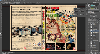
Time to import to the whole wrap; I coloured the background grey in order to line the panel up on the wrap when I imported it.
I lined it up and changed the colour back. I then fixed the recurring border-meets-bleed issue by again, dragging the black border to within the bleed guides.
I also erased the 'excess' film strip that was crossing over to the other panels by using the Eraser Tool.
I duplicated the folder paper effect from the front panel and dragged it across to the back panel (and organised the layers and their folders respectively). I made sure to check that all important logos were above the paper, as its blend mode was set to blend with anything underneath it.
I re-added the coffee ring back in by turning its visibility back on; I didn't do anything to it as I liked its size and position as it was.
I also added Black Dynamite back in, peering over the film strip and quite faded to give another dimension to the panel.
Because the BBFC information is important (as is the barcode), I drew them some white rectangles to make sure they stand out and are not lost in the design.
I noticed that the folded effect was interfering with film strip...
So I used the Rubber Stamp Tool to copy the texture above the fold to get rid of the fold line completely!
And that's all there is for Back Panel, I had a lot of fun with this panel; using editing skills learnt in Photoshop and creativity to make the film strip from scratch was a nice change of pace in primarily 'editing environment'.
All three panels are now complete!
Thank you for reading,
Hasnain
References
Text
DVD/Blu-ray packaging, n.d. Available at: <http://www.bbfc.co.uk/industry-services/video/dvdblu-ray-packaging> [Accessed March 2016].














No comments:
Post a Comment