In this post, I'm designing the front panel for the DVD Wrap.
This post will walk through the entire process, so be warned, it's a lengthy one...
So, I start by loading up Photoshop and creating a new file, entering the dimensions to match that of the front panel size.
I began by pasting an image still from Pulp Fiction into the document.
By clicking the 'tick' above the image, I confirmed the image import into the file.
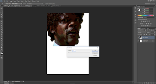
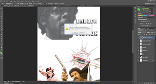
I then went about getting rid of the background around Samuel Jackson's (or Jules Winnfield..) head using the Quick Select tool, then pressing 'delete' when the desired area was selected. I then used the Rubber tool to just do a 'once-over' of the edges of the image to get rid of any lines the quick select may have missed.
As previously mentioned, I am trying to get a hand-drawn/poster-like look to the images, so I went to Edit, Adjustments, and selected Posterize. This adjustment allows me to get the effect I was looking for, with an adjustable slider to vary how strong the effect is.
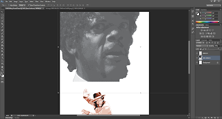
Once happy and confirmed, I then set about trying to make the image Black & White. I tried to achieve this by changing the Hue and Saturation settings, turning the saturation all the way down.
In retrospect, I should have just used the Black & White tool as it would have given me a nicer effect and more easily too. I didn't use it because I didn't realise it existed until after I had taken the Hue path.
I then imported a wallpaper image of Black Dynamite's 'Bullhorn' character striking a 'kung-fu' pose; this supports the '70s action-flick feel I'm going for.
Again, I used the Quick Selection tool to get rid of the wallpaper back ground, but this time I did this by selecting Bullhorn and creating a detailed 'selection-area/net' (I don't know the actual term) instead of the background. I used different brush sizes and switched between the '+' and '-' selection options to ensure I selected only what I needed. The brush sizes were very useful when working in smaller areas such as the space between Bullhorn's fingers.
I then applied the Posterize effect again to Bullhorn.
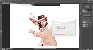
Bullhorn was then Hue-and-Saturated, this time checking the 'Colorise' option to recolour the image, dragging the Hue selector towards the Red colour, matching the theme of black, white and red I was trying to achieve.
I then made Jules' face larger and repositioned Bullhorn a little further down the image.
I went about searching for a hand-drawn style explosion to add to the wrap. The idea was to have an explosion with a car coming out of it and looking like it was directed at the viewer.
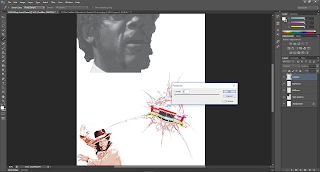
Using the Magic Wand tool, I selected the white background of the image the explosion was part of in order to delete it, leaving the explosion intact (irony) and its white background transparent; this allows me to move explosion around freely without worrying about the white 'box' interfering with other layers.
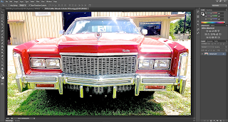
I found a really nice, high-quality picture of a 1970's Cadillac Eldorado; this type of car was seen as a symbol of wealth and power in the '70s, pimps and those types of characters owned these cars both in real-life and in the movies. I wanted to feature this car on the wrap to give more authenticity and feel to the them I was going for.
As I only wanted the car for the wrap, I used the Quick Selection tool to select the entire area around the car in order to delete it, leaving the area transparent behind the car. This was achieved by using the combination of the Add and Remove tools for the quick selection area, along with different brush sizes and patience; Photoshop kept 'guessing' as to which areas to include in the selection when it came to harder-to-see areas such as the large shadow underneath the car. I eventually decided to make a selection 'net' of the car itself instead of deleting the area around it. This proved much easier and involved a little work getting the chrome and windows to join the net. I then inverted the selection and deleted the background.
I dragged the car from its original image to the front panel, re-sized it and placed it on top of the explosion.
I rotated the car to increase the '3D' effect.
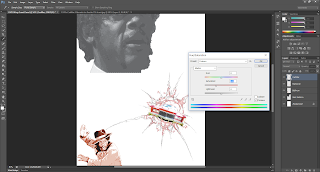
The car was then Posterize-d to make it look more hand-drawn instead of a photograph.
I adjusted the Hue & Saturation of the car to give it a more toned down look, matching the theme I was going for.
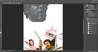
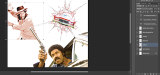
I found a high-quality picture of Black Dynamite pointing one of his signature revolver handguns out of a car window. I thought of using this image as part of a collage of action scenes on the wrap to convey the genre of the movie and the action it contains.
This image was fairly easy to process, I had to get rid of the nearly completely white 'sky' to leave the important details. This was achieved mainly using the Magic Wand tool as there only one main colour over a large area to get rid of. Unfortunately, the tool also picked up the reflection of the gun, meaning when it came to deleting the background, part of the gun would also become transparent. By using the Quick Selection tool to remove the gun from the selection are and going into finer detail with smaller brushes, I was able to keep the gun, Black Dynamite and his car.
I dragged the image onto the wrap, re-sized it and placed it in the bottom right corner of the wrap. I thought this was perfect because of the dimensions and layout of the image already and the fact Black Dynamite appears as though he is looking upwards, perhaps at the action unfolding above on the wrap?
This was exciting, I had been thinking of a title for this movie that didn't exist. It had to match the style of movie I was trying to emulate, and sound really cool; in the '70s and in these movies, if someone was described as 'Bad' it either meant he/she was cool or tough ("Ooh, see my brother Haz over there? He a baaad cat." ). The protagonist of my movie had to of course, be super bad, badder than humanly possible. And so, playing on the phrase "Stranger than Fiction", I came up with "Badder than Fiction".
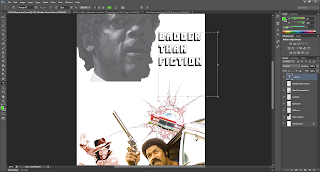
To match such a funky title and theme, I looked to other movie posters for ideas for fonts and general typography for my wrap. I came across the poster for 1971's "Shaft" and really liked the title font. I searched around and found the font, named 'Pioneer BT'. I downloaded it, installed it and typed the Badder than Fiction into Photoshop. I was really happy with the results, but didn't want the title to be all in one line, so I put each word on a separate line, which worked really nicely because of the 'blocky' look of the font.
I wanted to colour the text in, unfortunately when trying to do this, Photoshop would only colour the outline of the text. To overcome this, I rasterized the text into an image, allowing me to colour the inside of the lettering.
I wanted to colour the words three different colour to avoid monotony and because I think it looks visually appealing, making the text eye-catching. I chose Red for 'Badder' because we associate the two together, and I chose Yellow and Green because I thought they suited quite well, almost like a traffic light scheme!
I then enlarged the text and moved up the page, making it stand-off the black and white image Jules behind it.
I moved Bullhorn further up the page, putting him opposite the explosion- the the images are closer matched in terms of colour and tone, I thought the wrap looked better with this combination.
Although I now had an explosion on the wrap, I felt as though it was lacking colour- the only problem was finding a nice, hand drawn explosion that I liked was tricky enough the first time round. I changed up my search inputs a bit and managed to find a cartoon explosion, what was even better was that it was already a .png file, meaning it supports transparency and that there was no background to get rid of! According to the search results, the image from an unusual source, an online multiplayer game for children called Club Penguin!
I tried placing the new explosion over the existing one only to find that obviously, it blocks the original explosion from being seen. I was trying to think of a way to get them both visible- adjusting the transparency of the new explosion layer worked, but it made the colours too 'washed' out. I wanted a way to show the brightness and boldness of the red, orange and yellow bursting out of the new image. I thought about trying out different Blend Modes to see what would happen; after browsing a few, I found a mode I really liked that achieved what I wanted- Linear Burn allows the image on top to retain its colour (at 100% Opacity too) whilst showing the image/layer underneath it; you can now see both explosions whilst keeping the colours of the new explosion and the hand drawn complexities of explosion beneath it.
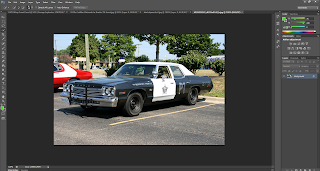
Now, what action movie is complete without police chase right? After finishing with the car and explosions, I felt as though a couple of police cars coming out of the explosion too would look really cool. So I went about finding a 1970's police car and found a high-quality image of a police-spec 1974 Dodge Monaco; what I really liked about the image was that it was taken on from a 'side-on' sort of view, meaning that the car is looking away from the camera, making for some interesting Photoshop possibilities...
Learning from the Cadillac, I used the Quick Select tool to make a selection consisting of the car, using various brush sizes to get the tyres, windows and tricky panels selected and get rid of the shadow underneath. I then inverted the selection and deleted the background and road.
I then dragged the Monaco on to the wrap, positioning above and to the left of the Cadillac and explosion; I also rotated it and resized it to make it look as if the police car was coming out of the explosion, but behind the Cadillac. When I looked at it, it felt as though the police car's side-on angle coming out of the explosion made it look like the officer was having a hard time catching his suspect- it reminded me of the "Dukes of Hazzard" and one of my favourite car chase movies, 1977's "Smokey and the Bandit".
After this, I thought that it looked a little odd that there was only a car on one side of the Cadillac and not the other. So I duplicated the police car layer, moved it to the right side of the car and flipped the image vertically- I also rotated it a little so the nose of the car pointed upwards more so as to not look like a mirror image of the other police car. "Yes!" I thought, that now looked 'complete' as a set; I really like how the cars and explosions idea turned out, especially because it looks like they're coming at the viewer.
I wanted to experiment a little and see what I could do with one more police car... So I duplicated the second police car and put it above the Cadillac; it didn't look very good to me because of the angle the police car was shot at, whereas the Cadillac picture had been taken head-on. I played around with the image and ended up with the third police car upside down- "Hang on a minute.." I felt as though I was on to something, I rotate the car the the under carriage was pointing diagonally and shrunk the car down to make it look as though it was far away in the background. Now that looks like a chase the baddest cat in town would get into; I was even happier with the end result now, the third car being significantly smaller than the other made it look there was sense of 'forced perspective' giving the car their 'popping out' effect.
I then applied the Posterize adjustment to the three police cars, all at different levels so they didn't look the same; the first police car had a level 5 added, second car, a level 4 and the third car had level 6 applied. Before this project, I had never used Posterize before and so it took some playing around with to get used to. I noticed that the lower the level number, the less detail is retained from the original image, with the opposite being the case with higher level numbers. I purposely chose lower numbers for the more prominent cars because I wanted the hand drawn effect to be more noticeable, whereas the third police car had a higher number because it could not be seen as easily, I didn't want its distinguishing features to be lost.
Many exploitation films had images of attractive women on their covers and posters, ranging from scantily clad women positioned provocatively against the protagonist to 'bad chicks' with guns and even bad-chicks-with-guns-wearing-just-lingerie. I wanted to use a shot from Black Dynamite I rather liked, its towards the end of the movie where Black Dynamite is delivering a dialogue- Gloria and Mrs Nixon (yes the President's wife) are positioned at Dynamite's feet, with their arms wrapped around his legs. I thought it was a cool scene but in the film all three characters are facing away from the camera. Luckily, there were some images online taken from a more head on angle, I don't know whether they were from promotions, deleted scenes or something else, but they were at a decent enough resolution to work with (yess!).
I started by using the Quick Select tool to make a rough outline of Mrs Nixon and then used smaller brushes to remove the carpet and background around her body and head. I realised then that Black Dynamite's leg was in the way, potentially causing problem later, but still added the arm to the selection for decisions later down the line.
I dragged the selection over to the wrap and played around with the possibility of mirroring Mrs Nixon so that she was back-to-back with herself. As you can see in the image, I also had an image cutout of Gloria from another promotional poster.
I then decided to go back and cutout Gloria from the same image I got Mrs Nixon from, also sporting a hovering hand due to Black Dynamite's legs and glorious bell bottoms. "No matter, I will cross that bridge when I get to it." What I differently however, is that instead of selecting them separately, I selected them in the same 'net', I like their proximity from each other and the position they're sitting and want to go about changing that. So I used different brushes to get their fingers and not the background and dragged the finished selection over to the wrap.
I found an interesting image of 1975's Dolemite leaning on his Cadillac along with an entourage of ladies and man dressed in a nice hat and suit. I knew I had to have the image on the wrap because it just oozed the theme I was going for (cats? check. Cadillac? check. bad mammer jammer? check.). What I found interesting was the colouring of the image because of its age, I don't know how to describe it with actual terms, but white looks beige and black looks brown- pretty cool! This lead to difficulty cutting out just the characters and car though; I used the magic wand tool to get rid of large areas of similar looking background and the quick selection tool make closer and more accurate selections around the car, peoples' heads and gaps between their bodies.
I was happy until I noticed the gaps between the people weren't empty, but filled with the background still! So, with the quick selection tool, a lot of zooming and guesswork, I managed to differentiate between heads, hair and the background to get a nice outline of the image I wanted without the background!
By this point and turned off the visibility for Gloria and Mrs Nixon until I could figure what I wanted to do with them.
I dragged Dolemite and Co. on to the wrap, unsure of where to position them for now.
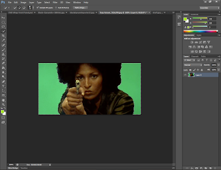
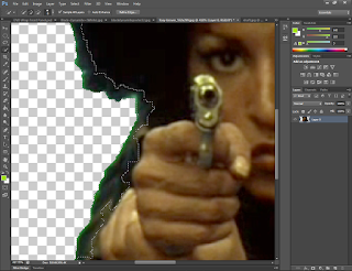
I then went searching for some image stills from different blaxploitation movies and found an interesting image of the "Queen of Blaxploitation" (Shaitly, 2016) Pam Grier holding a gun, but with a green background, I'm not sure what film it's for but it might be 1974's "Foxy Brown". I went about deleting the green with the magic wand tool and decided on what to do next.
In the meantime, I found a picture from 1972's Super Fly depicting the protagonist 'Priest' receiving a mean right-hook to his chin. I deleted the background using the quick selection tool due to similar looking colours proving difficult for the magic wand tool to differentiate between.
I dragged Priest and his assailant over to the wrap, moving on top of Dolemite but just there for now.
I found the back cover of an album by "Dolemite" main actor Rudy Ray Moore which looked like it could be used as to depict a character on the wrap.
So I used the quick selection tool to remove the everything Rudy Ray Moore...
... and then placed him on the wrap.
In the process of deleting the green background behind Pam Grier, I noticed that the edges of her hair and body were showing the green that was once there, obviously not looking good. So I used the quick selection tool to select areas of Pam where there was Green present.
I then tried to adjust the Hue/Saturation to match the green to her clothes, to make it blend a little more.
Now it looked less 'cut-out', I resized it on the wrap for later use.
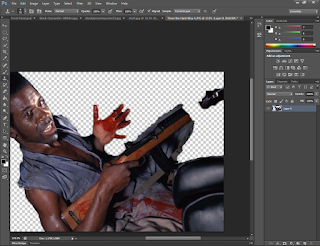
I found a still from 1974's "Three the Hard Way"; the character in the shot appears to be in a car holding a rifle whilst covered in blood. I like this image because of its actual clarity, use of a gun (of which we only have one so far on the wrap) and the emotion portrayed on the characters' face.
I selected the character his gun and the scenery immediately attached to him, this is because the result look strange when the character is missing a leg.
The only problem was the scenery was obstructing the weapon meaning it was split in two. I used the Rubber Stamp tool to 'bridge' the gap by getting Photoshop to copy the wood stock and barrel across from the left of the image over to the right. I erased what appears to be a muzzle on the right of the screen and used the tool to go over where the muzzle had been effectively turning the weapon into an elongated rifle.
Upon closer inspection, I noticed that the background is still visible between the character's fingers, making for a bad looking crop when zoomed out. I zoomed in and used the Eraser tool and various brush sizes to erase the leftover background from between his fingers.
This image was starting to shape up, but the crop around the character's leg looked quite jagged. I was going to try and fix this by using the Eye Dropper tool to get the colour of his clothes and paint some smoother lines near his leg.
I decided instead to use the Smudge tool to smudge and blur the jaggy edges instead making for an easier job; it also helped make the cutout near his knee and rifle look smoother than I think painting would have done.
I dragged the finished crop on to the wrap for later use.
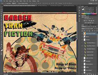
When I was thinking about action and chases, I remembered that sometimes helicopters get involved- either police choppers or gangster with henchmen shooting from open doors. I don't know much about helicopters and so I searched for 1970's helicopters and found and image of a 1970's Bell helicopter.
I used the quick select tool to select the sky background and deleted it. This was easier than using the magic wand tool because it was trying to delete the blue between the blurred propellers as well as the sky, making for a strange semi-transparent helicopter. Quick selection also gives greater control over what I want to include; an example of this is the tail rotor blades, they're too small and blurred to properly correct, so I deleted them instead.
Now, after deleting the sky, the blue between the blades was still an issue, so I tried to adjust the colour of the blue to something that would match the wrap better. I achieved this by selecting the Replace Colour option and used the eye dropper to select one of the shades of blue visible. I chose the replacement colour to be plain white (hex #fffff) as it would match white background of the wrap the best. It also ended up removing traces of blue found in the reflections and windows of the helicopter which was unintended but welcome.
I then dragged the helicopter onto the wrap, placing it higher up on the page, but still unsure as to where its final position would be.
I then applied the Posterize adjustment to the helicopter to make it look more drawn.
By now, I was really unsure as to where this wrap was going. I'd basically stockpiled a bunch of different images that were really cool, but would look way too busy/saturated if put together. I wasn't happy with the wrap in its current state and so I started again with a fresh canvas; I also decided to ditch the black, red and white theme and just go with the colours that came, and from there, edit either to make them stand out or look more vintage dependent on the element.
I inserted elements from the previous attempt I know I wanted to keep such as my explosive chase, the helicopter and Dolemite. I also took the time to re-study some of the blaxploitation posters I'd seen and looked for more as well.
It was at this point I realised that some of of my earlier findings regarding blaxploitation were untrue. I'd stated in a previous post that the 1970's posters "tend to show images of the main character along with a collage of action shots from the movie itself or just a large image of the protagonist that fills up roughly a third of the image (sometimes hand-drawn, other times actual images/photos)" and that modern inspired movies "almost always use images of the protagonist and other important characters in the film together".
When I researched further, I found that 1970's movies posters also did what the modern ones do and that most importantly, there is no one style to that they conformed to. They featured mixes of drawn and still images and cool quotes, but they are all executed in their own ways.
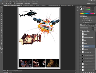
I went back to my wrap and added a black border to the page, not on the edge, but a little smaller- I noticed that there this was a design feature seen on posters for films such as "Cotton Comes to Harlem" and "Black Shampoo".
I thought of a way to in-cooperate some of the movie stills I had been gathering, so I created three, equal-sized rounded rectangles and placed them at the bottom of the wrap.
Then, I got the three image stills and placed one in each rectangle. I was already liking this organised, structured approach much more.
I added Gloria and Mrs Nixon back into the mix, with an interesting idea to compensate for Black Dynamite's missing legs...
RPGs. Yup, what could be badder than two foxy chicks with huge weapons right?
First, I placed Gloria and Mrs Nixon in a spot above the image stills at the bottom of the page, so it looked like they were resting on them.
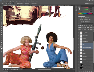
I found a high resolution .png render of an RPG online, so I placed it on the wrap and rotated it; using some layer management, I got the RPG to look as though Mrs Nixon was cradling it in her arm. The only problems were that her wasn't all there and that it didn't look as though the RPG was meant to be there.
I found out about an interesting and powerful feature in Photoshop called "Puppet Warp". This tool "provides a visual mesh that lets you drastically distort specific image areas, while leaving other areas intact. Applications range from subtle image retouching (such as shaping hair) to total transformations (such as repositioning arms or legs)" (Incorporated, 2016).
I had selected Mrs Nixon's arm separately from its original photo and placed it on the wrap where her arm should be. This is because Puppet Warp works using the entire layer; by only having the arm on a layer to work on, it makes it easier to edit. After selecting the Puppet Warp tool, it created a mesh around the arm.
I then clicked on separate points of the wrap to drop 'pins', telling the software the areas I wanted to transform and anchor in place; I dropped pins on Mrs Nixon's elbow and wrist to keep them in place, then proceeded to pull her hand downwards to make her arm hold the RPG more naturally. Once done, I confirmed the changes.
I used the Rubber Stamp tool to create of Mrs Nixon's arm to close the gap from he elbow to the RPG.
I then used the rubber stamp tool to close the gap on the other side of the RPG by extending Mrs Nixon's dress towards the RPG.
Happy with the result, I went on to duplicate the RPG layer and flip it vertically in order to give Gloria an RPG too. Putting this RPG underneath the two women layer wise too meant that it looked like Gloria was holding the RPG as it was standing up behind her. I used the rubber stamp tool again to extend Gloria's clothes (jumpsuit?) towards the RPG.
The "Wrap v2" was coming along nicely, but I wanted to add more to it to make it feel authentic. So I thought of the posters and what they had in common. I realised that most of them had some cool or witty 'tagline' about the main character and his actions or attitude. I was stuck between three separate ideas, one of which you can see in the image below. I also wanted to use another font seen in actual posters, so I went online a found one called 'Kabel Black'. I downloaded it, installed it, typed my three taglines up and managed the text box to fit on the page. They looked better than I imagined but I wasn't sure which one to use. I had the choice between:
"The baddest brothers these dudes are, messin’ with them? You won’t get far.",
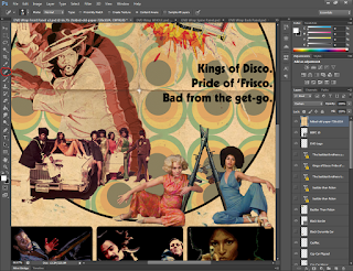
"Kings of Disco. Pride of ‘Frisco. Whoop-ass from the get-go." and
"The baddest brothers you ever did see, messing with them’ll bring you to your knees!"
Tough choice...
I remembered a design I saw a while ago, I can't remember whether it was on TV or in a movie; but it was a groovy sort of 'zoom' design- a character would appear as part of an opening credits and behind him/her a few silhouettes would appear, each a different colour and bigger than the last.
I tried to get this effect by duplicating Bullhorn twice, making each duplicate larger and larger.
The first duplicate was then placed behind Bullhorn and had its Hue & Saturation adjusted to make the image look darker and redder than the original.
I did the same thing again for the second duplicate, making it even redder.
I think the end result achieved what I was trying to show and looks super groovy.
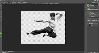
I was thinking, "This movie has guns, cars, girls, what else does it need?". Then I realised, '70s 'kung-fu flicks' like 1973's "Enter the Dragon" were amazing, and that I had to add some kung-fu to my wrap. So I went searching for a picture of the master himself, Bruce Lee. I found an image of him mid-air doing a super-sharp flying kick and had a great idea as to where I would place it.
I started by removing the background as usual, using the quick selection tool after trying the magic wand tool ended up taking out half of Bruce Lee's torso. Slowly but surely, I managed to create a selection net that didn't include the trees behind Bruce and got rid of the rest.
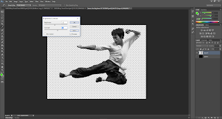
I tried adjusting the Brightness & Contrast of the image to make the image and stronger in terms of Black & White, as it looked a bit grey and washed out.
I placed a black background behind the cutout to make sure I hadn't missed anything when deleting the background; it's hard to see what to get rid of when it looks the same as the surface beneath. Sure enough, there were a few stray elements that needed erasing, I also cleaned up the cutout a little now that I could see where it stopped and started.
I placed Bruce Lee on the wrap, rotating him so his vicious kick was pointing upwards and put his layer underneath the police cars, but on top of the explosions. Boom. Bruce Lee was now flying out of an explosion in the middle of a kick.
Similar to the police cars, I duplicated Bruce Lee and made him a twin.
I then flipped Bruce No.2 horizontally so he was kicking the other way.
I wanted to see what the two Bruces looked like as silhouettes, and if they were placed behind the explosion. I didn't like it very much and reverted to the original idea.
I then tried out one of my other tagline ideas to see what it would look like. I still wasn't too sure about this one at this stage.
I tried the third one out and was even less sure about this one.
I wanted to see what it would look like if I were to change the title font from Pioneer to Kabel Black and go for a 1971's 'The Bus is Coming' look. I changed the font to all red and duplicated it to create black shadow underneath. I didn't like it too much as it looked too 'quiet' for all the action going on in the foreground and so I switched back to traffic-light-pioneer-goodness.
I noticed the black border I had drawn earlier wasn't equally spaced on all sides, so I went about dragging the border outwards so it did match, and ended up making the entire border a little larger because I thought it looked good.
In doing this, I noticed Bruce Lee No.2's foot was going past the border; I was going for a cleaner look, making the border act like a cut off, and so I drew a little white rectangle and placed it over Bruce's foot and under the border. Now it looked better.
Now starting to go through the design so far a little more closely, I noticed that there was some white space between the bottom of the Bullhorns and gaps between Dolemite's entourage. I didn't like it very much and so I went about fixing it.
I took the rubber stamp tool and painted downwards, extending Bullhorn's jacket on both of his silhouettes as they were the images directly above the gaps. Once painted, I was much happier with the overall look.
I started thinking about the tagline again, and decided to see what happens if I changed the second idea's wording a little. And so 'Whoop-ass' became 'Bad-ass', I immediately thought this was way better than before, and preferred it to the other ideas.
Then I thought about going one further, and changed 'Bad-ass' to just 'Bad'. And I thought that was perfect, I finally decided on this tagline and was really happy with it.
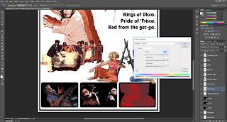
I was thinking about the image stills on the bottom and wondering if there was anything I could to make them look different and unique. I decided to try a filter named Solarize, I'd heard of it before but never used it.
I thought it looked pretty interesting, but the colours it removed and kept were the wrong way around. Red and Brown looked to muddy and it was hard to distinguish the image's features. I tried to adjust the Hue & Saturation to offset this a bit.
It wasn't really working though, so I tried to invert the image's colours to see what happened.
It flipped the dark areas and the light areas around, but also the colours!
So I went back to adjust the Hue & Saturation again to turn the image red again.
I noticed a little tick-box option named Colorize; when adjusting the Hue of an image, it normally shifts the colours of your image according to the Hue you select. When you choose to Colorize, it literally colours the entire image (on the selected layer) the colour of the Hue you choose. I chose this option when colouring the Bullhorns earlier.
I ticked it to see if it would make a difference. The image looked a bit more red and black now, I wasn't too sure about it though.
I adjusted the colours of the other stills to see what it would look like.
I wasn't happy with the outcome; so I switched the images back to their original colours.
DVD cases usually have age ratings on them, so I went about finding a BBFC age rating image to place in the bottom corner of the wrap. I found a really useful Illustrator file with vectors of each rating including the older back cover descriptions too!
I was only interested in the '18' rating sign, so I selected all of it in one go and dragged it over to the wrap.
After a few seconds of hesitation, the sign popped up as a 'Vector Smart Object'.
I shrunk it down to size and placed it in the bottom right-hand corner of the wrap; I put the sign's layer all the way at the top to make sure it wasn't covered or obstructed by anything.
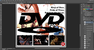
DVD wraps also feature the DVD logo on them, so I located a vector image of the logo and placed it on the wrap.
I similarly shrunk this down to size.
The only problem was, the surrounding colours were quite dark, making the DVD logo quite hard to see. In order to colour the logo I ended up rasterizing the vector.
I tried going for the opposite of Black and used the Paint Bucket tool to colour logo White.
I didn't like the look very much, and the 'video' part of the logo was unreadable when it touched the background of the wrap, so I tried painting it a variation of red.
Happy with that, I took a look at the front panel as whole.
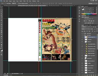
Time to place this panel on the currently empty 'Whole Wrap'. In order to avoid confusion when lining everything up, I made the front panel's background colour grey- this meant that if the Whole Wrap's front panel layout was completely grey, I had lined the panel up properly.
The only issue was that the black border was exceeding the bleed lines, meaning it faced the risk of getting cut off. So I shortened the height of the border a bit so it fell under the bleed lines.
I also had to bring up the bottom line of the border to within the bleed lines.
This meant I had to push the BBFC and DVD logos up a bit from the bottom so it looked cleaner.
Once everything was done, I changed the background colour back to white.
Update! 11/04/16
At this point, I was finished with the front panel and was designing the DVD Label. But it felt like there was something missing, all of the action was happening in the foreground, but there was nothing really happening in the background. So I took one of the designs I had drafted for the label and placed it on the wrap.
After shrinking it down and sending to somewhere near the bottom of the layer list, it looked like this:
A little too bright and now congested, I applied an adjustment to the new '70s wallpaper design, changing the Hue to a more Green/Blue colour and reducing the saturation to give it a more faded look.
I thought that looked really cool, reminiscent of the posters for movies such as 1973's "Sweet Jesus, Preacherman" and 1974's "Black Samson".
I wanted to add border to the design though, to make it look separate from the action in front. So drew a circle slightly larger than the design.
I the made the circle a little smaller to make some room between the circle's border and the main border.
I moved the circle around a little ensure the space between the borders was equal on each side.
Finally, the circle and its border were sent over to the whole wrap to mirror the changes.
Update 2! 25/04/16
Hello again front panel. Miss me?
I got some feedback from my classmate Lukas on the design so far, he really liked it but me some a useful suggestion- as this is a 1970's style film, why don't I make the poster-style wrap look old?
This led me to a small conundrum, do I make the poster look brand new, as though its a new film dedicated to old-style, or do I make the poster look like I found in my attic, as though the movie really is from the '70s?
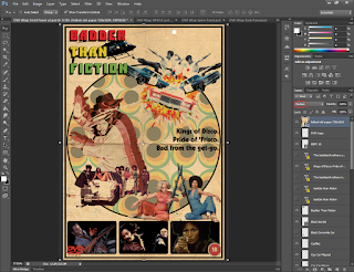
I decided to try the latter and see where it goes. Now, how do I make a poster look really old? Fold lines, brownish, faded paper sounded like a good idea. So I came across just that, an image of brown, worn and folded paper!
I placed the paper on to the wrap panel; I tried putting the paper image at the bottom of the layer pile (stack?) but it didn't look right, all the images on top looked too new, and it didn't look right having plain white colouring when the paper underneath was already going brown. So I tried putting it back on top but reducing the opacity, this was even worse as it looked like it was just placed on top like tracing paper!
Not really sure what to do, I decided to try playing with the Blend Modes. After one or two, like magic, everything underneath the paper showed through without any white, looking all faded. I was shocked, I didn't expect it to look so drastically different and more importantly, super cool! I browsed a few more blend modes and settled on 'Darken'- this blend mode kept the vividness of the colours and, like the name states, made all the images look a bit darker compared to something like 'Darker Colour' which looks similar, but makes everything look a little more washed out.
With this new vintage-ness discovered, I realised I could Posterize the still images and see how they look.
Wow! I was really happy with the way they turned out, I decided to keep them Posterized.
The problem with the paper texture was that there was some strange spots of discolouration on it, two of those spots happened to be located where Gloria and Mrs Nixon were sitting, making their skin look a little weird.
I solved this by going to the paper layer and using the Spot Healing Brush tool; this tool basically analyses the images and replaces the area you click with imagery created from the surrounding image (very clever). So I clicked on the unwanted spots and like Clearasil, the spots were gone!
I tried to tackle this by applying a layer mask to the still images. A layer mask allows you to control the transparency of the layer it is linked to through the use of colour. I attached a layer mask to the image of Foxy Brown first to test out procedure; I then used black and the brush tool to create 'spots' near the visible outline, slowly making the outline disappear and make the the image beneath more look much cleaner.
After trying it out on that image, I did the same to the image of Priest getting punched, making the image look much cleaner again. I didn't need to do it to the man bleeding in the car, I presume this is because the image was cut away from a dark background, meaning the cutout lines wouldn't be as visible.
I then turned my focus to the top of the new paper image, where were two holes in the paper. I didn't like the look of them and so went about trying to get rid of them.
I used the rubber stamp tool again to basically go ahead and 'clone' the surrounding area across the holes to make them disappear. (In retrospect I could have used the spot healing brush tool but I didn't think of it at the time.)
Then it was time to bring the new changes over to the full wrap; as I write this, I'm thinking that would be much easier to work on the full wrap itself, but I prefer working on the panels individually as its easier and more organised.
Transferring meant trying to bring the new layer masks across as well, for some reason I couldn't get them to come across to the whole wrap, only the image would transfer. So I had to apply the layer masks to the images, making the become one item each. I then dragged these 'masked' images across and placed them where the original cutouts were, deleting the original once the positioning was finalised.
I then made two more changes, the first was to alter the paper image's opacity; I lowered this down to 70% so the wrap didn't look too dark or brown. This changed was then applied to the full wrap as well.
The last change was to bring the BBFC rating image to the top of the layer stack- this is because it was underneath the paper, making it look a bit yellow/brown. Dragging it above the paper returned it to its proper appearance. I didn't move the DVD logo as it doesn't really look any different when moved up.
Oops...
Minor update for a minor mistake. When I used the .ai file with the BBFC ratings, I used the old 1985 version instead of the 2002 update; this has now been fixed.
And that's the front panel! Now to work on the two remaining panels and the DVD Label!
Thank you for reading,
Hasnain
References
Text
Shaitly, S., 2016. Pam Grier takes raunch to the ranch. The Guardian, 13 January. Available at: <http://www.theguardian.com/film/2011/dec/11/pam-grier-quentin-tarantino-blaxploitation> [Accessed 27 April 2016].Incorporated, A.S., 2016. Warp images, shapes, and paths in adobe Photoshop. Available at: <https://helpx.adobe.com/photoshop/using/warp-images-shapes-paths.html> [Accessed 27 April 2016].





































No comments:
Post a Comment